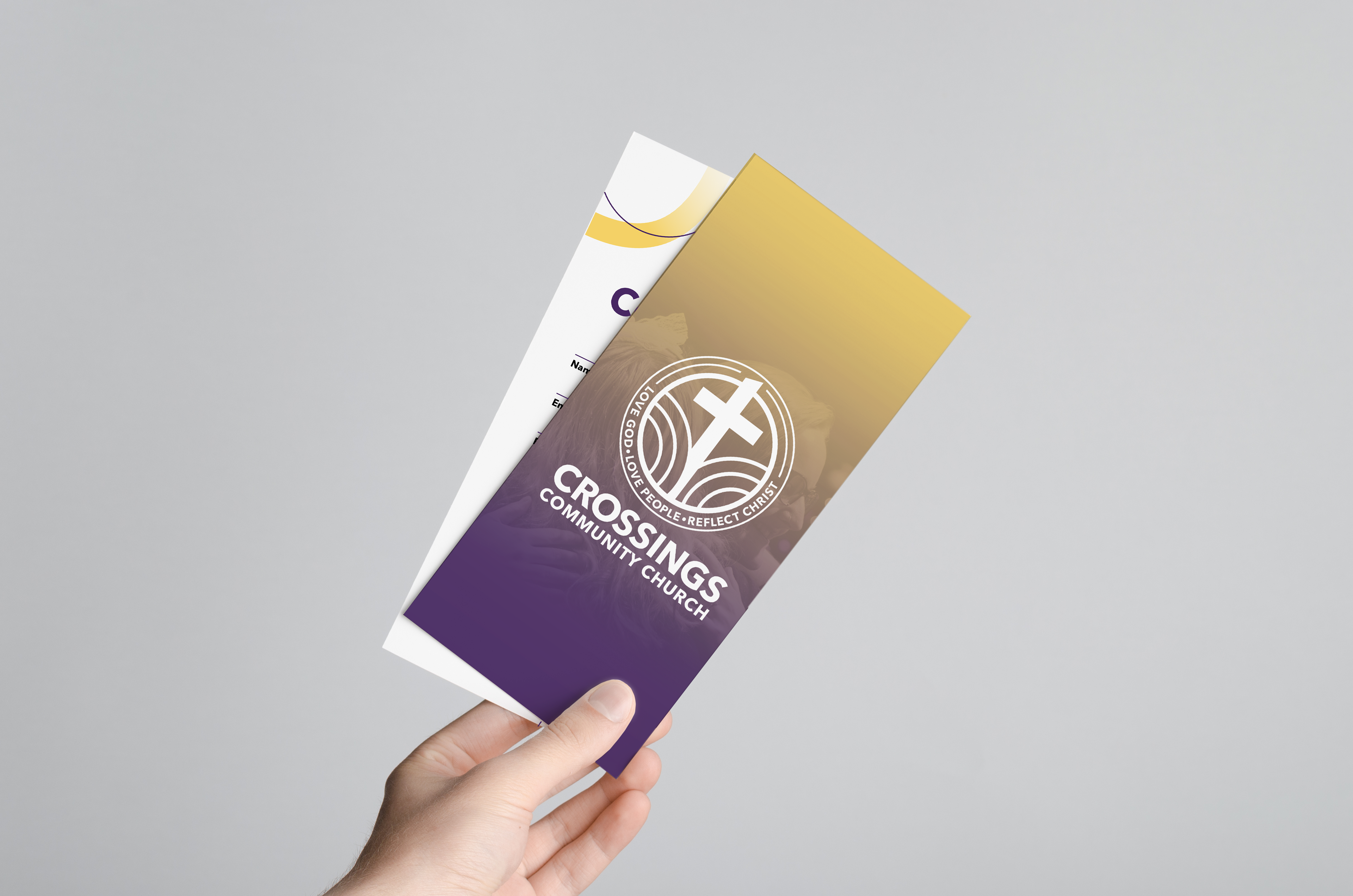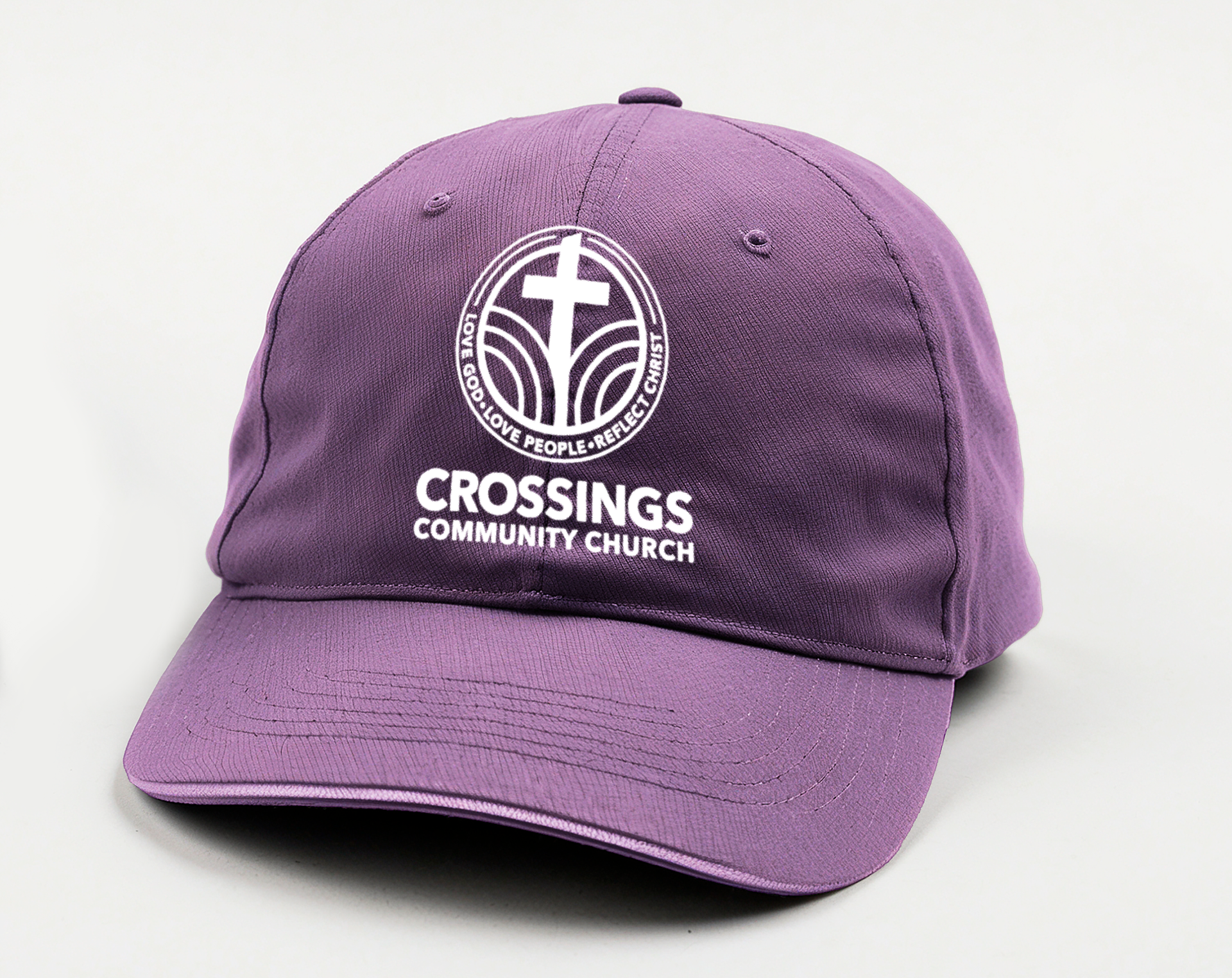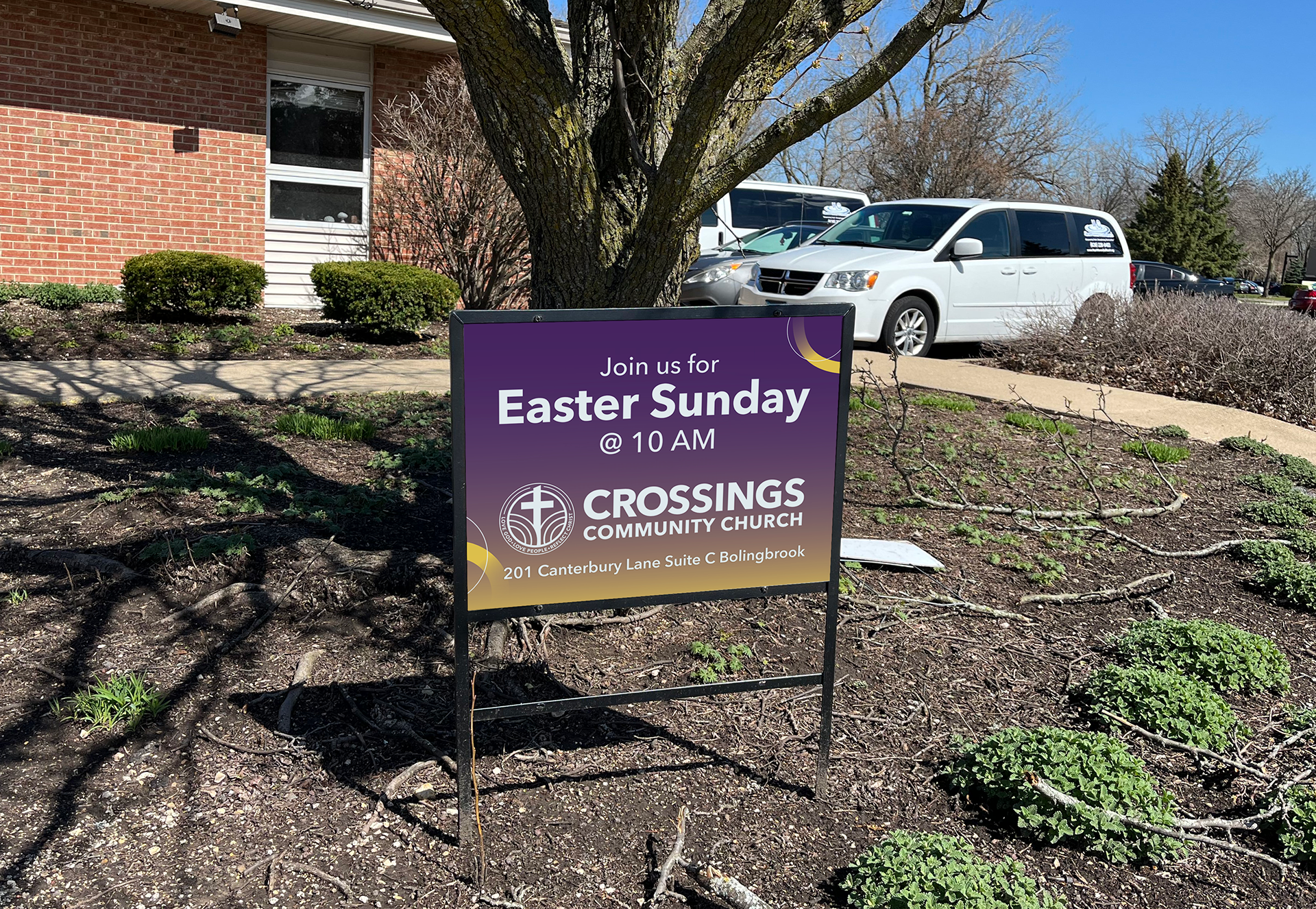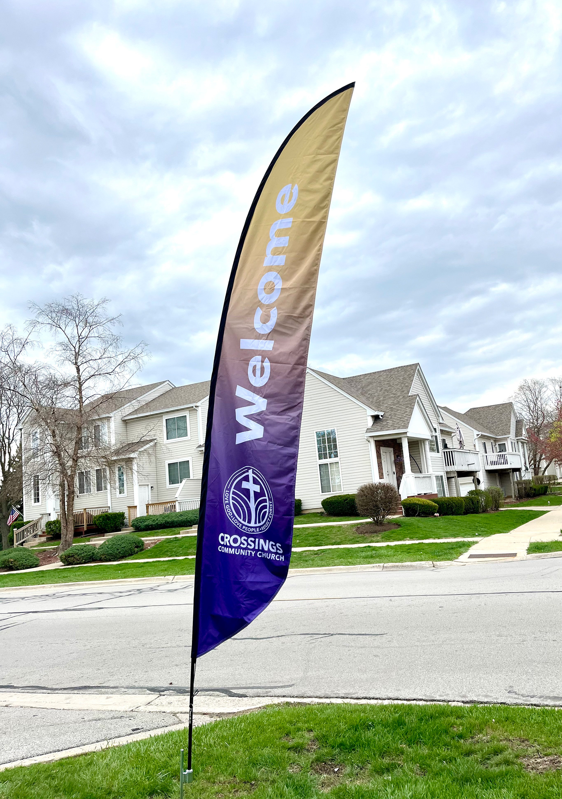
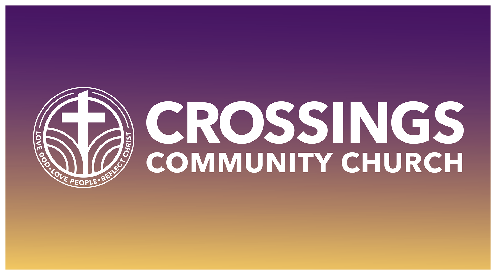
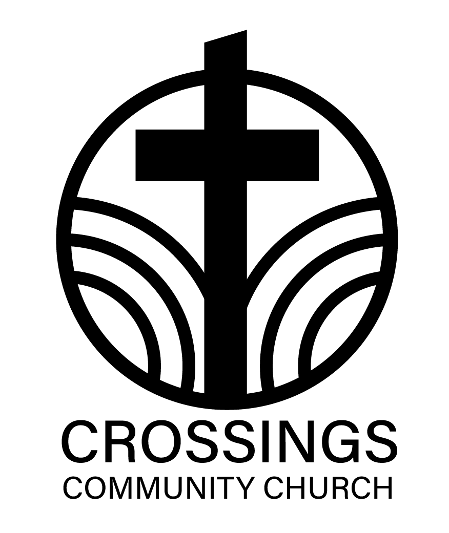
Located in the Chicago suburb of Bolingbrook, Crossings Community Church sought a logo and visual identity that would reflect its role as a pillar within the community and a modern, welcoming place of worship. Much of the church’s story is rooted in scripture passages about crossing physical waters and God’s faithful provision through both literal and metaphorical storms—symbolized in the logo by circular waves and a cross emerging through them. The fonts Avenir Next and Merriweather were selected for their playful, dynamic qualities, offering versatility in type treatments while reflecting the church’s warm and welcoming spirit.
Client: Crossings Community Church
Role: Lead Designer
Year: 2025
Deliverables: Handcards, Signage, Logo + Visual Identity
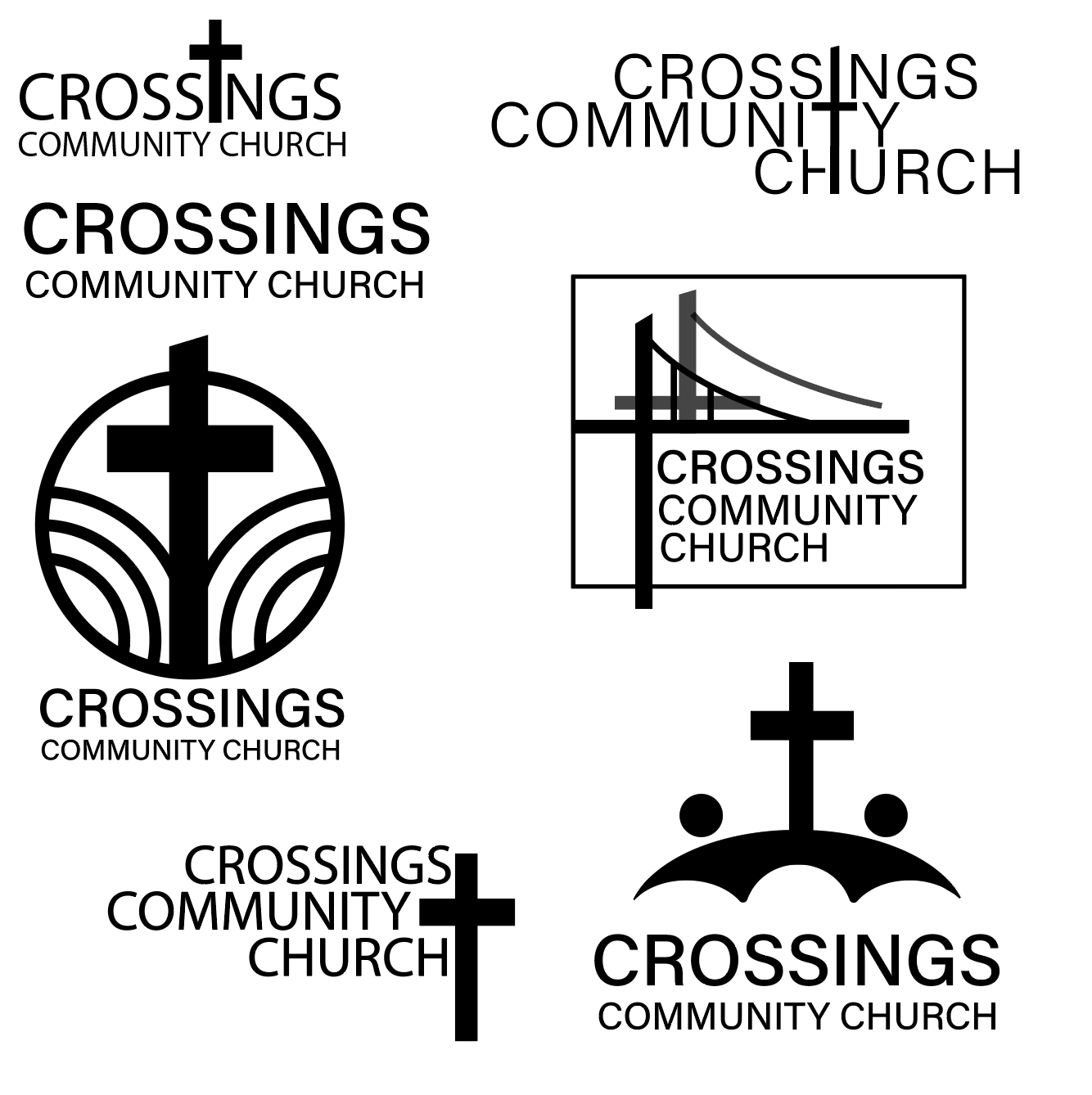
Initial logo concepts drawing on the concepts of a bridge and passing through water.
Mockups of both created and proposed brand items.